
Strategy · Information architecture · Mobile
Mobile Strategy + Resident Lookup
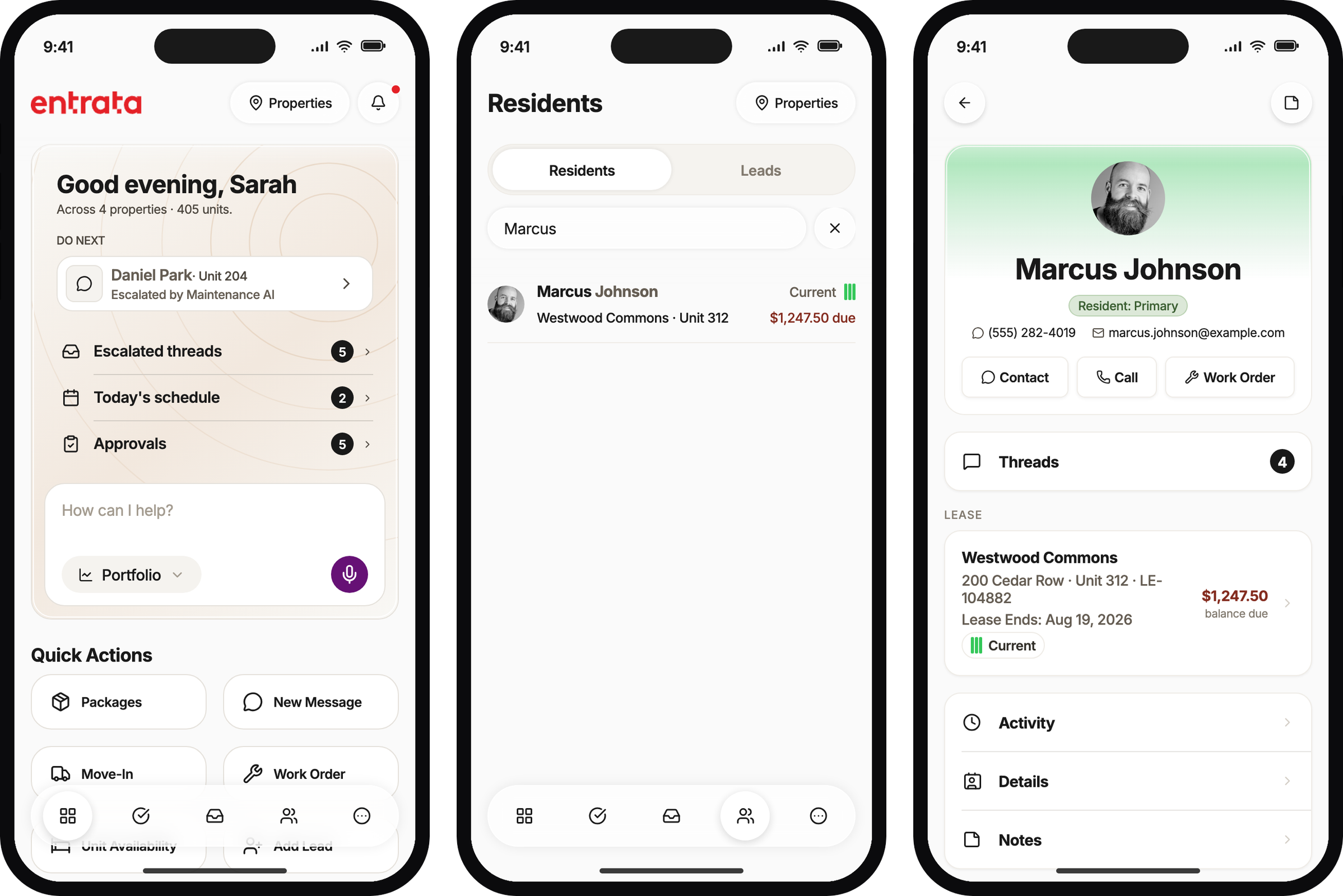
Entrata had never shipped a mobile app for property managers. Facilities had a phone app. Everyone else had desktop Entrata, or the same product squeezed onto a phone browser. Resident lookup is a core piece of Entrata, not an OXP workflow. Anytime a resident has a question, staff pull that person up on desktop, or they try the same profile on a phone, which is a terrible experience. We asked property managers what they already try to do on a mobile device. Looking up residents was always first. On a walk they wrote it down, called the office, or fought the web app. I designed a quick search and a light profile: enough to answer the question and make small adjustments, without bringing over desktop work like a financial move-out that needs a desk and time to get the details right.
Problem
Staff were already looking people up
Entrata had a facilities mobile app. It did not have a staff app for property managers. The OXP app was the first time the company put Entrata in a native phone experience for that audience. There is plenty in that app that belongs to OXP. Resident lookup is not one of those things. It is a core piece of Entrata that people use every day.
A question from a resident means pulling that person up. On desktop that is routine. On a phone it meant the web version of Entrata, which is a terrible experience, or a workaround: write it down and look it up later, attempt it on the phone anyway, or call someone who is still at the office.
We asked staff what they already try to do on a mobile device. Looking up residents was always first. They get the question while they are walking the property. The job is already happening. The product just was not there.
The question was not whether to ship a mobile app. It was which information architecture earns a second open, and which wedge proves it first. A light profile had to be enough to answer the question and make small adjustments. Major desktop work, like a financial move-out, stayed off the phone. That is desk work. You want time, focus, and the details in front of you.
~4,600
Gong calls filtered for mobile and field themes
30+
Processed customer feedback transcripts across the beta program
5
Staff-facing competitor apps scanned for moat versus parity
Process
What the research corrected
Early home concepts leaned toward a performance dashboard. That matched how desktop OXP talks about the business, and it would have failed the person standing in a parking lot. Gong and beta notes kept repeating next action, not portfolio charts.
We also treated Resident Lookup as a directory you browse. Field conversations start from a name, a unit, or a car. Search had to lead. Even then, the first search fields were name, unit, and email. Fire-lane and parking scenarios stall without a plate, and the usability simulation made that impossible to ignore.
Every major claim in the strategy memo carried an explicit confidence label. We had interviews, call research, and competitors. We did not have our own retention curve. That gap is why the first ship was sized to learn, not to complete a vision.
| Input | What it changed |
|---|---|
| Gong (~4,600 calls) | “Look up people on the phone” was the remembered competitor workflow. Field-to-desk round-trip was the waste. Maintenance is already phone-only. |
| Feedback transcripts (30+) | Regional managers would be the heaviest users because of travel. Ledger and approvals from the field. A hollow app after a mandate burns the manager who pushed it. |
| Competitive scan (5 vendors) | The market is fragmented single-function apps. Cloning desktop information architecture would not win. Platform-owner workflows (escalations, playbooks, workforce) are the moat; a KPI wall is not. |
| Usability sim (4 personas, 32 walkthroughs) | Glanceable headers and tile previews worked. Plate search, wrong-property empty results, and the All Properties picker were ship-stoppers. |
Entrata had already proved the failure mode. A tablet product got deployed from the top and then sat unused. Top-down distribution gets the icon. Bottom-up job-fit keeps it.
Three bets for the first ship
Treating mobile as “OXP, but smaller” would have shipped a KPI wall and a nav tree nobody could use outdoors. We cut that framing and kept three bets.
The regional manager is the hinge. They mandate adoption and they use the app themselves. If the app is great for them, they push it. If they mandate a hollow app, their credibility takes the hit with ours. That mechanism was inferred, not measured, and the memo said so.
Resident Lookup is the daily wedge for on-site staff. Charge disputes, walk-ins, and after-hours questions do not wait for a desk. Heavier analytics waited until attribution quality was trustworthy. The trade-off was real: the home looks less like a command dashboard, and the first ship proves a conversation, not a portfolio review.
| Bet | Product consequence |
|---|---|
| Action-first home | Command Center: Daily Briefing + Quick Actions, not a KPI dashboard |
| Regional manager as hinge | Scope, multi-property, and “across my portfolio” language on home and search |
| Resident Lookup as daily wedge | Search → profile hub → drill-ins for financials, lease, household, vehicles, work orders |
Solution
Daily Briefing and Quick Actions
Daily Briefing sits at the top of home so role and scope are visible without hunting nav. Quick Actions are the verbs: packages, message, move-in, work order, add lead. We talked about burying those under desktop-shaped modules. That would have failed the field job, so they stay on the first surface.
When connectivity drops, Quick Actions collapse toward the work that can still run offline. Move-In is the extreme version of that rule. The rest of this case is the everyday version: look someone up and answer the question in front of you.
Search, then the profile
The Residents tab stays quiet until you search. Recent people are a shortcut, not a rent roll to scroll. That matches how a conversation starts: a name at the door, a unit on a package, a question about a balance.
The path is search, open the hub, then drill in only if the header is not enough. Message, work order, and note stay available without leaving the person. Ledger and household stay read-only in this cut. Field utility without premature write surfaces.
The charge dispute at the door
The charge-dispute path is why lookup had to ship before analytics. Someone is standing there asking about a late fee. Staff need the balance, the last charge, and enough ledger detail to talk, not a full AR workstation.
The usability simulation walked that scenario with four personas. All four completed it. Glanceable headers did the work. What still hurt was a running balance on each ledger line, which desktop AR users expect, and getting to the person at all when the only clue is a car.
Search cannot start from a license plate
Search fields said name, unit, or email. Parking and fire-lane work starts from a car. In the simulation, that path hesitated or failed for every persona. Gong had already described looking people up in the field. We still shipped a search box that could not see a plate.
The vehicle is on the profile. The plate is in Vehicles & Pets. None of that helps if you cannot get to the person from the parking lot. Plate search is still on the fix list. So is the empty-results pattern when property scope is wrong: a quiet chip that says you are searching one community, with no way to widen, looks like “no resident.”
Try it in the prototype
This is the Expo prototype we used with partners. The people tab lands on Residents, not a directory. Search a name, open the hub, then Financials. A plate still returns nothing. That was the point of putting a walkable build in front of people.
Start on Home, open the people tab, search Marcus, open the profile, and tap Financials; a plate like EWX-4429 still returns nothing.
The choices that held
| Choice | Why / what we dropped |
|---|---|
| Action-first home, not a KPI dashboard | Staff on feet optimize for next action. Portfolio charts belong later, after attribution is trustworthy. |
| Daily Briefing as the home anchor | Role and scope without hunting nav. A module tree copied from desktop would have buried the day. |
| Quick Actions as primary verbs | Move-in, work order, packages, add lead. Two taps from the same home staff already open. |
| Search-first lookup, not a browseable directory | Conversations start from a name or unit. A rent roll to scroll is the desk pattern. |
| Hub plus drill-in sheets | Act (message, work order, note) without leaving the person. Align with desktop concepts, do not clone desktop information architecture. |
| Read-only ledger and household | Field utility without premature write surfaces. AR still completes a charge dispute in view-only. |
| Property scope always visible on search | Wrong scope returns empty results that look like “no resident.” The chip is the start of that fix, not the end. |
What partners got
The strategy memo named the bets, the confidence on each claim, and the kill criteria for the first 90 days after GA. That was the artifact for product partners: mobile as distribution for the AI workforce, with owned engagement metrics sitting beside shared agent-touched outcomes so a surface problem and an agent-layer problem stay distinguishable.
The Expo app made Command Center and Residents walkable. A dedicated lookup prototype carried the four-persona simulation: 32 walkthroughs, clustered findings, and a validation queue. A SwiftUI module mirrored the lookup flow for a native-team audience, the same handoff pattern we used on Move-In.
- Three bets written down with UI consequences: action-first home, RM as hinge, lookup as daily wedge.
- Usability blockers logged: plate search, property-scope empty states, All Properties multi-select trap.
- Left out of this cut on purpose: performance analytics on home, ledger writes, and treating lookup as a desktop profile clone.
What's next
Targets we have not measured yet
What we left behind was a coherent mobile information architecture story and a lookup flow staff could actually try, not a shrunk desktop. The work shaped roadmap sequencing and prototype direction. It is not a measured GA retention curve.
Initiative targets were set as learning goals for a CSM-activated cohort, with explicit kill criteria. Until first-party usage lands, these are goals, not results.
| Metric | Target (unmeasured) |
|---|---|
| Weekly active staff use (habit, not installs) | >50% of staff at OXP customers, 12 months after GA |
| Regional manager DAU at 30 days (pilot cohort) | >50% rolling 7-day |
| Community manager DAU at 30 days post-mandate | >40% (3+ days in the past 7) |
| Charge dispute completable on device (sim) | 4 of 4 personas completed |
| Plate-only parking lookup (sim) | Hesitated or failed across personas |
What I would change
- Put plate search in the first lookup cut. Waiting for the simulation to prove a Gong theme we already had wasted a cycle.
- Treat wrong-property empty states as a blocker, not polish. A quiet scope chip without a widen action looks like a missing resident.
- Keep lookup and performance analytics in separate stories. Mixing them would have turned the daily wedge into another dashboard.
Sibling case: OXP Mobile Move-In Scanner (Quick Action depth)
Built with — Research synthesis plus Expo to make the strategy testable; a dedicated lookup prototype for the usability sim.